
Your User Is the Hero
Your product is just the Guide

Hook Users Like a Pixar Movie
Picture the first 10 minutes of a Pixar film – the emotional sequence in Up or the opening of Finding Nemo. In those brief moments, you’re hooked. You care deeply about the characters and want to see their journey unfold. They make you feel something, fast. What if a product’s onboarding could do the same? In the first few minutes of getting in your product, can a user feel progress, clarity, or even delight? They should.
Most users decide whether a product is worth their time within minutes. Nearly half will abandon a new software during setup if it feels like a chore. That means the stakes are high, and onboarding is more than a UX problem, it's a product adoption problem. If your product is amazing, users should feel that immediately. Onboarding is your only shot to make that happen.
The secret is to stop treating your product as the hero and start making your user protagonist. Great onboarding shouldn’t feel like a feature tour or a checklist. It has to be a narrative that engages them, earns their trust and shows them they’re in control.
Just like Pixar captivates audiences by putting a relatable hero on an exciting path, successful products onboard users to solve their own problem. This is done without having to show off the features but by showing the user what’s now possible.
This is where storytelling and behavioral psychology become essential tools. Make the user the hero, and your product the guide. When done right, you earn trust, unlock motivation, and improve retention - all in a matter of minutes.
Why Storytelling in Onboarding Works
Something I keep repeating is humans are wired for stories. A report in the Journal of Consumer Behaviour shows that stories trigger mirror neurons in our brains – the same cells that fire when we perform an action or experience something ourselves. So when users encounter a story, they watch it unfold and feel certain emotions. That emotional simulation makes the experience more persuasive and more memorable than any static tutorial.
But a story only works if there’s a relatable character. In your product, that’s the user; not the interface, not the brand.

Your product isn’t the hero. It’s the Guide.
Take Slack for example. When a new user signs up, they’re dropped into a friendly chat with Slackbot. It welcomes you, asks a few easy questions, and replies with small tips, one at a time. The user leads. The bot helps. Even the line “I’m just a bot” lowers expectations and tension. The whole experience makes the user feel in control, not tested.
Slack’s product marketing director once said that new users begin “interested but skeptical.” The job of onboarding is to help them “discover whether [the product] does what you hope.” That discovery, the moment when skepticism turns into excitement, is the emotional payoff.
Slack’s onboarding tells a tiny story: a hesitant beginner becomes a confident communicator. That’s what good narrative does. It transforms the user’s self-perception, along with their understanding of the tool.
Designing the Hero’s Journey in Onboarding
So how do you actually turn your user into the hero of their own story? It’s simpler than it sounds - just follow the basic structure of a classic narrative arc.
Frameworks like Joseph Campbell’ Hero’s Journey and Dan Harmon’s Story Circle both follow the same fundamental pattern: a character leaves their comfort zone, pursues a goal, faces challenges, receives help, and returns transformed. It’s a formula humans intuitively understand, because we’ve been telling it for thousands of years.


I’ve adapted this pattern into a five-part onboarding structure that aligns with how people actually experience progress. It’s practical, repeatable, and rooted in how we process stories, emotionally and cognitively.
1. Hero (User) and Their Goal
Every great story starts with a character who wants something. In your product’s onboarding, that’s the user. They signed up because they have a goal - to organize projects more easily, learn Spanish before a trip, design a website without code. Your job is to recognize that goal early and make it feel achievable.
As positioning expert April Dunford puts it:
Customers don’t care about your unique features, they care what those features can do for them.
Your onboarding should answer that question immediately: “Will this help me do what I came here to do?” If users don’t feel that clarity, they’ll leave.
Set up the user’s mission right away. One effective tactic is to let users define their goal during sign-up.
Duolingo nails this. It begins by asking learners to set a daily goal (5, 10, or 15 minutes) and choose their reason for learning. This simple act personalizes the experience and reconnects users with their motivation. Now the product isn’t a teaching vocabulary, it’s helping someone prepare for travel, reconnect with family, or grow their career.
Notion takes a similar approach. In the sign-up flow, users select how they plan to use the tool (personal notes, team collaboration, etc.). The product then tailors example content accordingly. It’s a small shift with big impact. Instead of showing off features, the product mirrors the user's goal back to them.
And it works. Products that clearly align with a user’s intent are far more likely to earn engagement. 73% of customers expect companies to understand their needs and when that expectation is met from the start, trust builds.
So in this first chapter of onboarding: introduce the user as the hero. Show you understand what they’re here to do. Then give them a fast, motivating glimpse of success.
2. Conflict (Problem a User is Trying to Solve)
No hero’s journey is complete without conflict. In onboarding, that conflict is the friction between the user's intent and the product's learning curve. Will they feel empowered or overwhelmed?
As a builder, you might be tempted to remove all friction in the name of “seamless UX.” But here’s the thing: zero friction doesn’t mean zero drop-off. In fact, a bit of well-designed friction can make users more engaged, not less. The goal shouldn’t be to eliminate all conflict, it’s to help users overcome it.
A poor onboarding experience drives people away. 74% of users will abandon a product if setup is confusing. Research suggests that when users invest some effort early on, they’re more likely to stick around. Why? Because making progress through friction creates ownership. Struggle, then clarity - that’s how belief forms.
The key is purposeful friction. Not random hurdles, but small, empowering challenges that teach by doing.
Take Notion. New users land on a blank page with a checklist like: “Type ‘/’ to add something.” When you follow that tip, a command menu opens and suddenly, you’ve unlocked a core mechanic. No tutorial, just trial. That’s not friction that frustrates. It’s friction that rewards. Duolingo does something similar. After sign-up, you’re dropped right into a lesson - match a word, translate a sentence. You try, you guess, you get feedback. You’re not reading about language learning, you’re already learning it. That early activity is designed to trigger the goal-gradient effect, when people see themselves making progress, they become more motivated to continue.
When users solve a small challenge, they feel pride. That feeling attaches to the product. This is active learning and it builds confidence. Users move from “What does this do?” to “I figured this out,” and that creates emotional momentum.
There’s another layer here, the IKEA effect. People value things more when they’ve helped build them. In onboarding, even tiny efforts like customizing a profile or completing a checklist can increase attachment. But it only works when the task is meaningful and achievable.
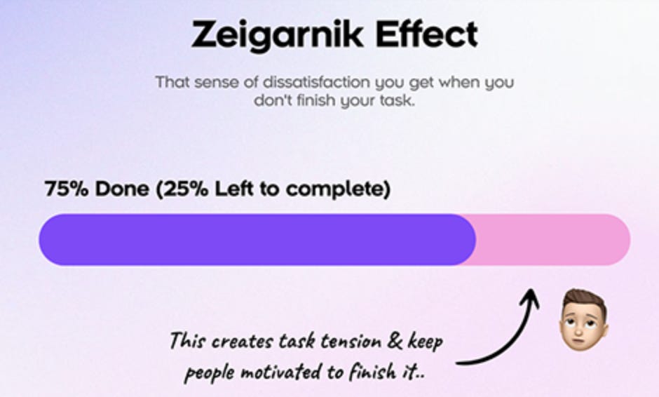
And if you want users to stick with onboarding, consider leaving a few tasks unfinished. The Zeigarnik Effect explains that humans are more likely to return to incomplete tasks because our brains hate open loops. A checklist with 75% completion nudges users back in. It’s the same psychological itch that cliffhangers exploit because our brains crave resolution.
The best kind of friction doesn’t block users, it pulls them forward.
Let users struggle just enough to feel capable.
3. Guide (Product)
In every hero’s journey, when the going gets tough, a guide appears like Gandalf did for Frodo. The guide helps the hero succeed. In onboarding, your product plays this role. It should offer support and guidance to reach the goal.
A great product doesn’t flood the user with advice. It offers the right nudge, at the right moment, in the right way.
One way to do that is through contextual coaching. Tooltips, prompts, and micro-tutorials can be triggered by user behavior, showing up exactly when they’re needed. In Figma, as you explore the interface, brief tooltips appear like “Press R to draw a rectangle” paired with small animations that show the action. This type of guidance is effective for two reasons:
It adapts to different learning styles (reading, seeing, doing).
It respects user autonomy. You can follow the tip, skip it, or move at your own pace.

Personalization is another key trait of a great guide. The best products shape the path based on who the user is and what they want.
Notion does this during onboarding. If you say you’re in marketing, the first templates you see are campaign trackers, not student notes or journals. That’s a nice touch: “We know what you need. Start here.” It reduces decision fatigue and accelerates the path to value.
Great guides also provide feedback and encouragement. Small moments of acknowledgment like a checkmark, a progress bar, a “nice work!” tap into feedback loops that reinforce learning. Behavioral Science tells us that immediate feedback makes people more likely to keep going. It turns effort into momentum.
And the guiding role doesn’t have to stop after the first session. Email sequences, embedded tutorials, and contextual help can all extend the guide’s presence. As long as they’re useful and timely. Irrelevant advice feels like spam. But the right message at the right moment can re-engage a user who got stuck or distracted. Especially if it’s paired with social proof or a clear next step.
Your product should feel like a helpful companion. Always available, never in the way. The user should think: “I’ve got this. But if I don’t, help is right there.”
Show the way, but let the user walk it.
4. Climax (Aha Moment)
Every hero’s journey builds toward a turning point, the moment where everything clicks. In onboarding, that moment is the user’s “Aha!” It’s when they first feel the value your product promised. That flash of recognition is behavioral and it drives retention.
Users who hit that insight early are far more likely to stick. Your job is to engineer onboarding so this moment happens fast and hits hard.
Let’s look at what that looks like in real products: In Trello, dragging a card to “Done” and realizing, “My workflow is now visual and under control.” Using a template or linked database in Notion and thinking, “This can replace three other tools.” With Figma you click through a prototype and think, “Design and testing are happening in one place.” In each case, the user completes an action and feels something powerful. It’s clarity, confidence and momentum. That ties directly to their original goal.
So how do you make it happen?
Start by identifying your product’s core value action, the thing users need to do to truly “get it.” Then remove anything that delays it. If the ‘aha’ is creating a 5-task project board, don’t ask for billing info first. Don’t show a settings tour. Just get them to that outcome.
And when they reach it? Make sure they notice. Don’t assume users always realize when they’ve done something meaningful. A budgeting app, for example, might say, “In 60 seconds, you auto-categorized 100 transactions and spotted $200 in savings.”
That’s clarity. That’s emotional payoff.
Now, not every product can deliver real value instantly. Some tools only shine over time or with more data like analytics dashboards or social platforms. In those cases, simulate the aha. Show sample data. Preload a template. Let users see the payoff before they’ve earned it.
Sprout Social did this by loading demo content so users could explore reporting features without connecting their real accounts. That glimpse of future value builds anticipation: “Ah, this is what I’ll get once I’m set up.”
Another way to trigger aha? Show users they’re not alone. For products with a community layer, onboarding should include cues that signal activity and belonging. A fitness app might say, “Your friend Alice just finished a 5K” or “Join 5,000 others in this month’s challenge.” That moment of recognition “people like me succeed here” can be just as motivating as a core feature.
By the end of this stage, the user should have achieved something (no matter how small) and felt the emotional lift of progress.
The hero has crossed the threshold. They’ve tasted success. Now they want more.
5. Resolution (First Win + Next Step)
The hero’s journey doesn’t end at the climax. It ends with resolution. A return, a shift, or a next mission. In onboarding, this means locking in the user’s first success and guiding them into meaningful, ongoing use. The “Here’s what’s next.” phase begins.
Start by celebrating the win. This isn’t fluff, it actually taps into the brain’s reward circuitry and reinforces habit. When a product makes users feel capable, they’re more likely to return. It’s classical conditioning. Pair the product usage with positive outcomes, and users will come back for more.
But celebration isn’t enough. After success, users naturally think: “Now what?”
Without clear next steps, they stall. So use this moment to project the next chapter. Just like stories often end with a glimpse of what’s ahead (“…and the heroes set off on more adventures”), onboarding should suggest the next action. For example: Trello, after showing a sample board, prompts users to create their own and Notion encourages users to import real content or try a new template. These nudges say, “You’ve got the basics. Now build something that matters to you.”
And while you’re doing that, reinforce the value they’ve already received. A quick recap like “In 5 minutes, you did X, achieved Y” helps users recognize their progress. That reflection can come via a modal, a sidebar message, or even a well-timed email: “You’re all set up! Here’s what you accomplished and here’s what to try next.”
This is also the right time to softly introduce any conversion path. A hard paywall here often backfires. But a gentle, contextual prompt can work well especially if it’s tied to the user’s goal. For example, “Want to bring your team in? Upgrade to Pro for unlimited collaborators.” That message is obviously selling a plan. But it’s perceived as offering a new capability. It feels like a continuation, not a disruption.
It’s also very important to extend the sense of support. Onboarding might be done, but the user journey isn’t. Let them know where to go for help, community, or deeper learning: “Need help? Visit our Knowledge Base.”, “Join our next webinar.”, “Talk to an expert.”
Even if they don’t act immediately, knowing support is nearby builds trust. Some products go further with personal outreach like a “how’s it going?” email or pairing new users with a customer success rep. These touches create a sense of partnership with a rapport.

In a world where most onboarding feels rushed or generic, support at this stage becomes a differentiator.
By now, the user should feel confident, supported, and already successful, however small that success might be. And when that happens, something powerful kicks in: they begin telling others.
Their journey continues. They may not be a user but they’re an advocate now.
The hero becomes the guide.
Checklist for Product Onboarding
Crafting narrative-driven onboarding might sound abstract, so here’s a practical summary to anchor your approach:
Make the customer the hero, your product the guide
Frame all messaging around the user’s goals. Avoid centering the story on your features, instead, map them to what they unlock for the user.Hook them fast with value
Like a Pixar film, grab attention early. Provide a quick win or a clear glimpse of the end benefit in the first few minutes. Answer their unspoken question: “What’s in it for me?”Keep it simple
Minimize cognitive load. Use plain language. Make the next step always obvious.Use progress to build momentum
Break onboarding into small steps. Celebrate each one. Show progress visually. This taps into the goal-gradient effect.Design for the ‘Aha’ moment
Identify the one action that best delivers your core value. Drive users there quickly, and make sure they recognize it when it happens.Add social proof
Show success stories, real user activity, or community moments. People feel more confident when they see others succeeding.Test and evolve the story
Collect qualitative feedback. Study where users drop off. Improve clarity, adjust friction, and refine your flow like it’s a narrative in beta.
By approaching onboarding as a storytelling exercise underpinned by basic human psychology, you do more than train users. You engage them, inspire them, and set them up as the hero ready to conquer their goals with your product.
When users feel seen, capable, and guided, they stick around to succeed. And in the end, that’s the real win-win: your users achieve success, and your product achieves adoption.